
 💡Don’t underestimate the importance of the look and feel of an Excel model! People get very attached to the way that their file looks, and when I’m building or revamping someone else’s model, I’m very careful to try and stick to the colours, themes and fonts the original builder has used.
It’s tempting to jump in and add my own stamp to the model and that would be fine if the model is mine to maintain forevermore, but usually it’s not. I’m building and improving something that the original builder has worked very hard on, and I need to respect their design choice. Unless of course the design is horrible and doesn’t make sense, such as using different 🤡random🤡 colours for the sake of it (ugh😒) so then it’s a matter of correcting their colour choices whilst staying true, as much as possible, to the original look and feel of the model.
Because design choice is a very personal thing and if you charge ahead and change everything, the user will feel that they’ve lost ownership of the model. When you strip away the look and feel too quickly, people can feel like their work, and their thinking, has been dismissed. It’s funny that something as superficial as colours or fonts can have such an impact on how we feel about a document.
When they get the model back, I want them to open the file and still feel that they own the model.
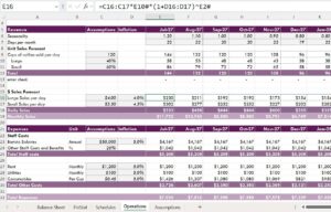
The goal isn’t to impose MY style or model layout. The goal is to make THEIR model better one. I LOVE my purple-themed colour scheme 💜that I use in my Danielle Stein Fairhurst Training Courses | LinkedIn Learning and other courses (as shown above), but I’d never impose that on a client. In my experience, change works best when it’s considered and respectful.
This article is published on LinkedIn. Read the comments here.


